I Let AI Into My Studio — But I Didn’t Let It Paint

I have spent most of my life in two worlds: art and education. Both depend upon curiosity, experimentation and, perhaps most importantly, the confidence to think for yourself. So I understand why the arrival of artificial intelligence has made many artists and educators uneasy. If a machine can generate an image, write an essay or suggest a creative solution in seconds, where does that leave the messy, difficult and deeply human business of learning and making?

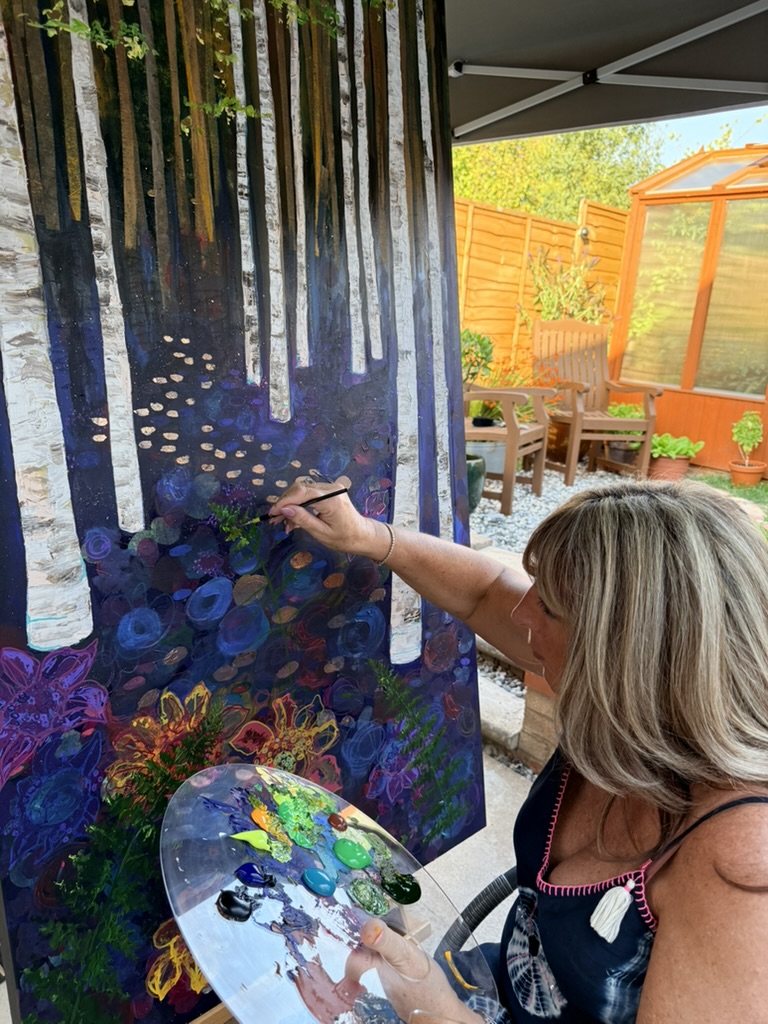
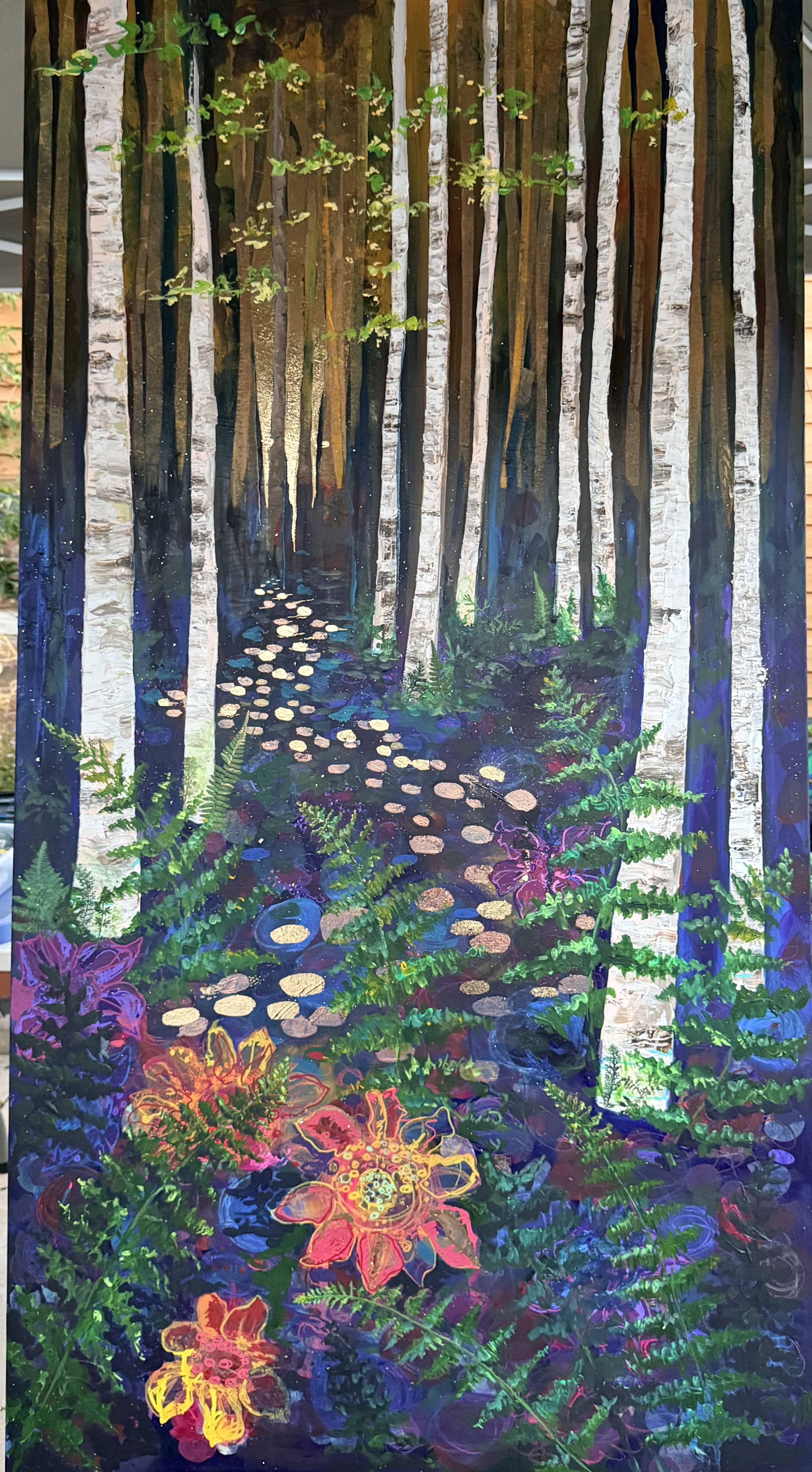
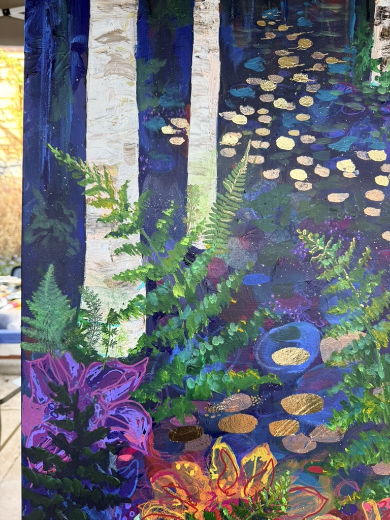
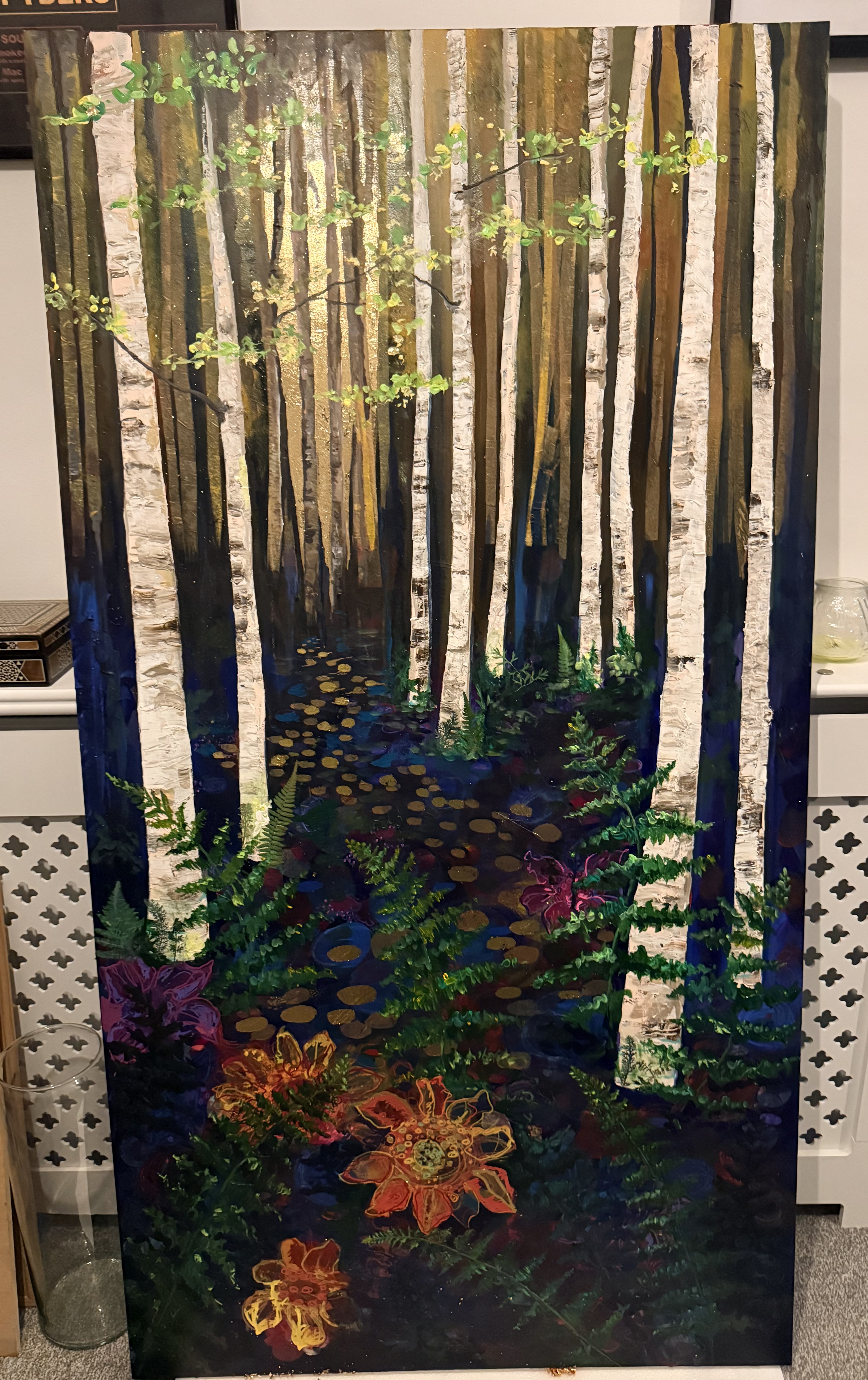
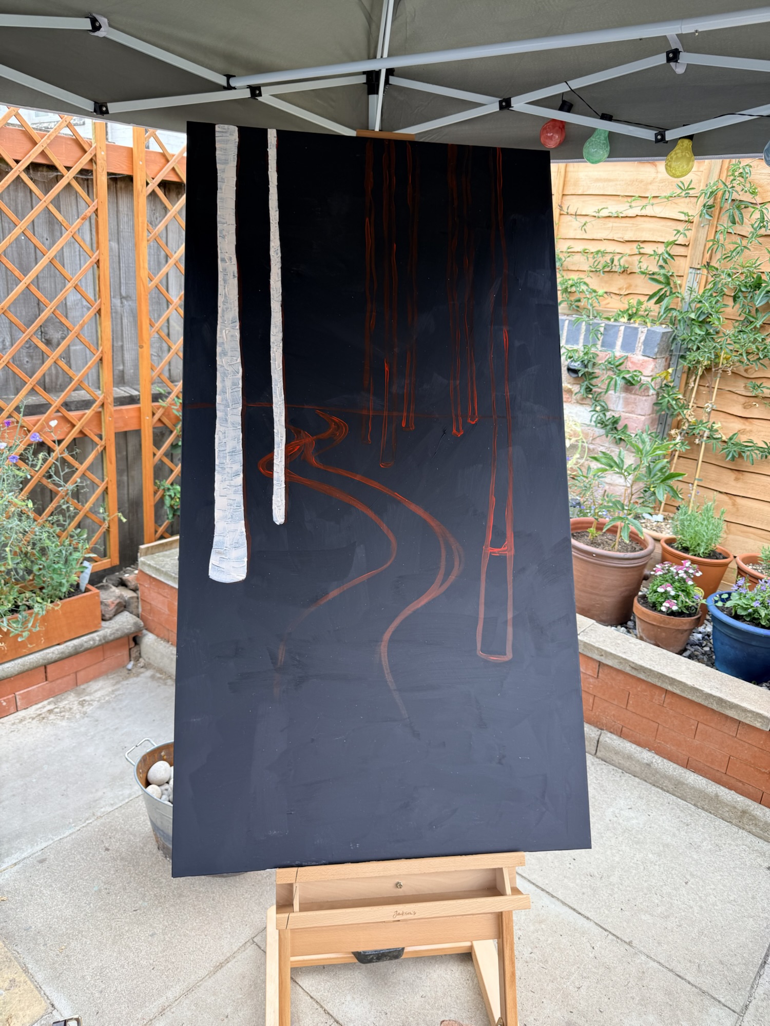
Recently, I found myself considering the question rather differently. I showed my unfinished work to AI and asked for a critique. What followed didn’t make the painting for me, it did something far more interesting: it made me look at my own painting differently. My painting is a large, highly textured woodland of silver birches, saturated colour and abstract flowers—I began using AI much as I might use another artist whose opinion I respected. I photographed the unfinished canvas and asked for a critical response.

My first stop was about colour theory. I uploaded a picture of my unfinished piece to do a colour analysis. I know that I can go a bit too wild with colour and often need to rein it in! I used Adobe Color Generator to analyse what I had already. I find that very useful as a way of seeing what I’ve got and where to go next.

Next, I wanted to know if I was on the right track with my composition. Rather than simply telling me that it looked good, the AI analysed the colour relationships, composition, areas of visual tension and the hierarchy of the marks. One suggestion was instead of adding more and more flowers to the forest floor, I should choose five or six “hero flowers” and allow the others to become supporting characters. It was such a simple observation, but I hadn’t seen it myself. I had become too close to the painting.

What happened next is important. I didn’t simply follow the instruction. I thought about it. I agreed that the painting needed greater visual hierarchy, but decided that I would develop those hero flowers using pastel rather than more paint, because I wanted to preserve the looseness and immediacy of the surface. We then discussed the gold leaf I intend to introduce later. The AI suggested restraint: rather than creating an obvious golden pathway through the forest, I could use broken fragments of gold to imply light and movement, allowing the viewer’s eye to complete the journey. Again, I may or may not ultimately follow that advice. The decision remains mine. And surely that is the crucial distinction between using AI as a substitute for creativity and using it as a tool for creative thinking.

I think that the big take-away here in terms of teaching is that AI should not be used in art education to remove the creative struggle; it should be used to make that struggle richer.

That distinction matters. Art education has never simply been about producing an attractive finished object. It is about looking, questioning, experimenting, making decisions, taking risks, evaluating outcomes and developing an individual visual language. I would argue that this is not a “cheat” any more than Caneletto’s use of the camera obscura. Every era has it’s technology.

If a student types a prompt into an AI image generator and submits the result as their artwork, very little of that learning necessarily occurs. But if they use AI to interrogate their own work—Why isn’t this composition working? What happens if I change the value structure? Which artists might challenge the way I’m approaching this? Give me three different interpretations of what I’ve made—then AI can become a powerful instrument for reflection.

For me, the really exciting possibility is AI as a form of perpetual studio critique. Art teachers know how valuable a good question can be.

We rarely improve a student’s work by simply saying, “Put some blue there.” We might instead ask, “Where does your eye go first? Is that where you want it to go?” AI can provide some of that dialogue whenever a learner needs it. The teacher, meanwhile, becomes even more important because students need to learn how to evaluate the advice they receive rather than automatically obey it.

AI presents us with a surprisingly similar question, albeit on a vastly more sophisticated scale. Like the camera obscura, it can extend what the artist is able to see or consider. I can show AI my unfinished painting and ask it to analyse the composition, identify weaknesses or suggest possibilities I haven’t considered. But just as the camera obscura didn’t hold the brush, AI doesn’t have to make the creative decisions. I decide whether its suggestion is useful, whether it belongs within my visual language and, ultimately, whether to ignore it altogether.

The skill our students will need in an AI world is not simply the ability to generate. It is the ability to judge.

Which idea is worth pursuing?

What is derivative?

What feels authentic?

What should be rejected?

What happens when I deliberately break the AI’s suggestion?

These are sophisticated creative decisions and link into the critical thinking that we know is a vital skill going forward.

Perhaps the challenge for art education is not to keep AI out of the studio, but to teach students that inviting it in does not mean handing it the paintbrush.

Avoiding Cultural Appropriation in Art Education

Cultural appropriation can be understood as using intellectual property, traditional knowledge, cultural expressions, or artifacts from someone’s culture without permission. It is most likely to be harmful when the source culture is a group that has been oppressed or exploited in other ways (as with Indigenous Peoples), or when the object of appropriation is particularly sensitive or sacred (Scafidi, 2005). However, it is not always simple to identify when cultural appropriation is occurring.

Here are two examples of learning experiences that use creating poles to understand the nuances of cultural appropriation.

Example 1: Cardboard Box “Totem” Poles

In the learning exchange video series “appropriation,” Susan Dion gives the example of elementary school educators having their students make “totem” poles out of cardboard boxes. She explains that this activity trivializes the importance of poles in Haida culture. Dion compares making totem poles to having children make a model of a Catholic chalice and host and pretending to give and take first communion. This would be clearly recognizable as inappropriate and offensive.

Example 2: Pole Carving

The entire school community at Taylor Park Elementary in Burnaby, B.C. is involved in a new project under the guidance of Indigenous artist Simon Jameswhose ancestral name is Winadzi. He is from the Kwakwaka’wakw Nation. James is also working with Squamish Nation Elder Sheryl Rivers to honour local teachings and protocol.

Beginning in January, all students from Kindergarten to Grade 7, along with staff, are getting the chance to carve and listen to James’ teachings and storytelling. James created the design after several months of connecting with students, staff and families, who shared their values and stories with him.

See the video below, which also shows the early stages of the work.

In the first example, cultural appropriation occurred for the following reasons:

Poles have a spiritual significance, which was not honoured in the activity.

  • Indigenous communities that created totem poles have been exploited through colonialism in many other ways.
  • They were not involved in the assignment to make poles, and they did not grant permission to the teacher to make poles.
  • The creating of the poles was not interwoven with Indigenous approaches but was a one-off assignment within a predominantly Westernized approach.

In the second example, making poles was a respectful activity for the following reasons:

  • Indigenous community experts were actively involved.
  • The activity was deeply integrated with Indigenous pedagogical approaches.
  • The spiritual significance of the pole was recognized by following proper protocols and values.

Adapted from : https://opentextbc.ca/indigenizationcurriculumdevelopers/chapter/appropriate-use-of-indigenous-content/

The take-aways for us:

  • Do not ask students to create art using indigenous images or symbols: totem poles, dream catchers, Haida art etc.
    • Instead – think about the inspiration and work from that – indigenous communities value their elders and the animals in the environment, how might we communicate that through art?
    • Traditional Haida art is often limited to three colours: white, black and red and focused on line. Can you represent an animal that you feel a connection to, using three colours of your own choice and an emphasis on line?
  • Everything that we use from an indigenous origin (art, stories, realia) needs to be accredited and acknowledged. If that’s not possible – don’t use it.
  • If in any doubt contact your school’s indigenous education coordinator

Murakami & Art Appreciation

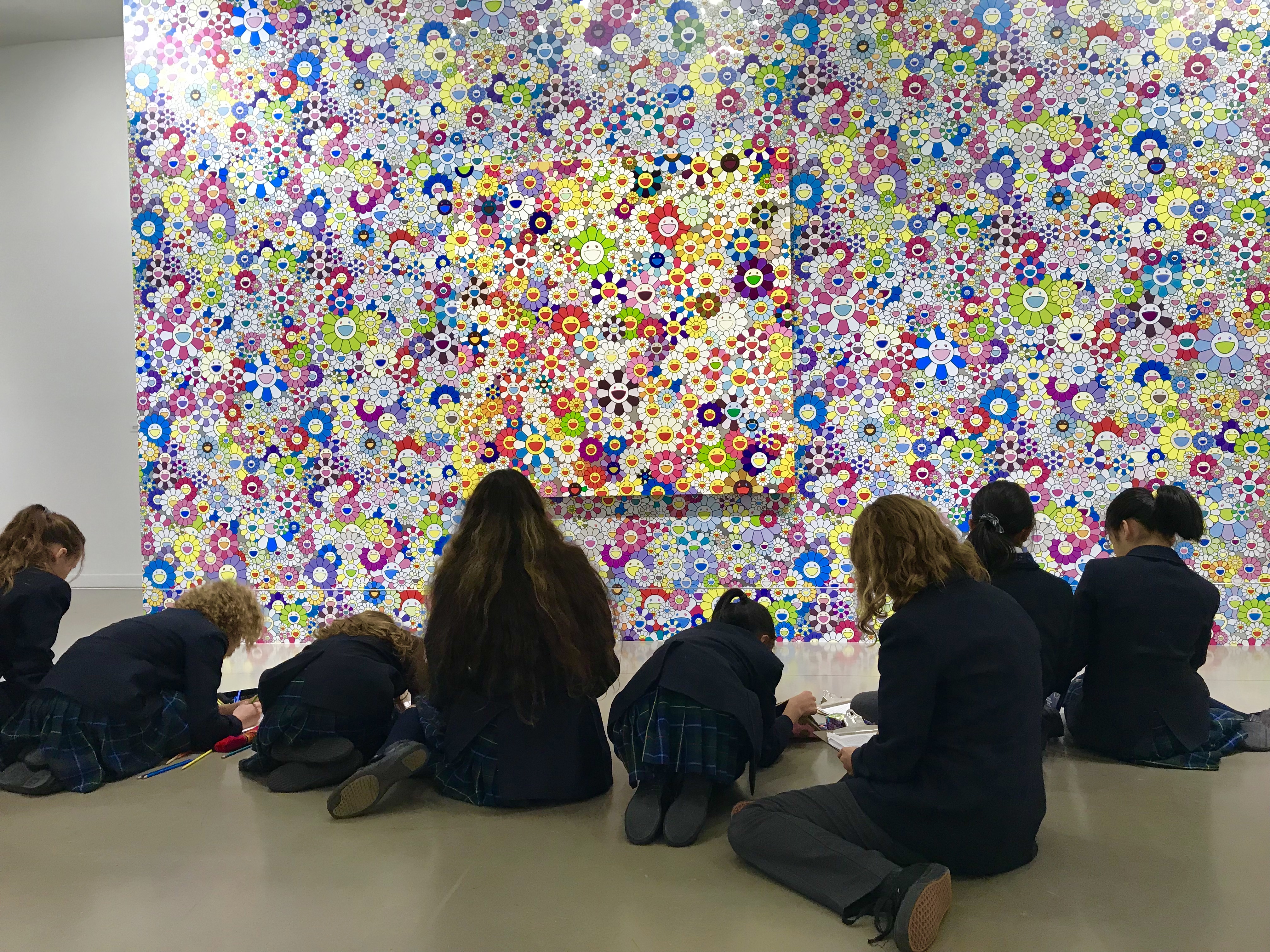
My Grade 6 classes have been learning about the work of Takashi Murakami and went to visit the exhibition of his work, “The Octopus Eats its own Leg” at the Vancouver Art Gallery.

Photo 2018-03-09, 11 49 17 AM

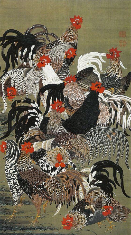
Murakami is a fascinating artist who revisited his cultural roots after the 2011 earthquake that hit Japan. His super-flat style harks back to the work of Itō Jakuchū who was creating work in the Edo period (1603 – 1868). Murakami connects the flatness of his work to Japanese art as a whole and contrasts it with the western ideas of perspective and depth.

Museum_of_the_Imperial_Collections_001

It was wonderful to see how excited the students were to experience the art ‘in the flesh’! Having researched Murakami for a couple of weeks,  they approached the exhibition well prepared and equipped some depth of knowledge. I felt so proud to see them all engrossed in the work and disappointed to leave after 90 minutes in the exhibition.

It can be tricky to balance appreciation of an artist and not to stifle a student’s creativity. (See #11 Classroom Creativity). At the exhibition, students sketched some of the arhats (enlightened Buddhist healers), but will move forward on their own creative journey.  Now that they have understood Murakami’s ideas of super-flat images, they are going to explore cultural symbols of their own and create their own super-flat collage.


Now draw a picture!

CDA6803E-930D-4D70-8F91-857E5FB86E9935E1A4DA-B0B8-4980-BCF6-E99CCB06798F11AA380F-189E-4D7E-8ADC-7FDE98D5975135E1A4DA-B0B8-4980-BCF6-E99CCB06798FStudents are often asked to illustrate their work and this can be intimidating for those who feel that they ‘can’t draw’ or as one student said to me yesterday, ” I get mad because my drawing never matches what’s in my head”.

Creating parameters for their drawing can offer the scaffolding that some students need. The UK newspaper, The Guardian,  remembered the 81st birthday of illustrator Raymond Briggs with these suggestions:

Quentin Blake is one of the best-loved illustrators of children’s fiction. This lesson by Access Art uses Blake’s work to inspire pupils to experiment with a variety of drawing techniques. There are three simple exercises for students to try: using continuous line drawing to create a picture without lifting their pen from the paper; building a picture from a series of separate, straight lines; using a watercolour wash. The aim is to get pupils taking risks with their drawings and trying new ways of working, as well as widening their experience of drawing and getting them away from the idea that a particular way of drawing is right or wrong.

At the end of the session, encourage students to evaluate their work by putting a sign that reads “Playing it safe’”at one end of the room and another that says “Taking a risk’”at the other. Pupils can put their drawings between the two signs, depending on the level of risk they have taken. You will find lots of other ideas on the Access Art website, including warm-up exercises and interesting activities, such as drawing to the beat of a metronome.

Art consultant Paul Carney has developed some resources for teachers to help them introduce students to a range of drawing styles such as realism, abstract, technical and graphic. These are designed to combat low confidence among students by helping them to develop a style that suits them. He has created a set of drawing lessons using all of these methods and more. They contain instructions for pupils and teachers, as well as links to information on well-known artists. This sample lesson, suitable for students aged between eight and 10 years old, focuses on creating a drawing using “one point perspective”.

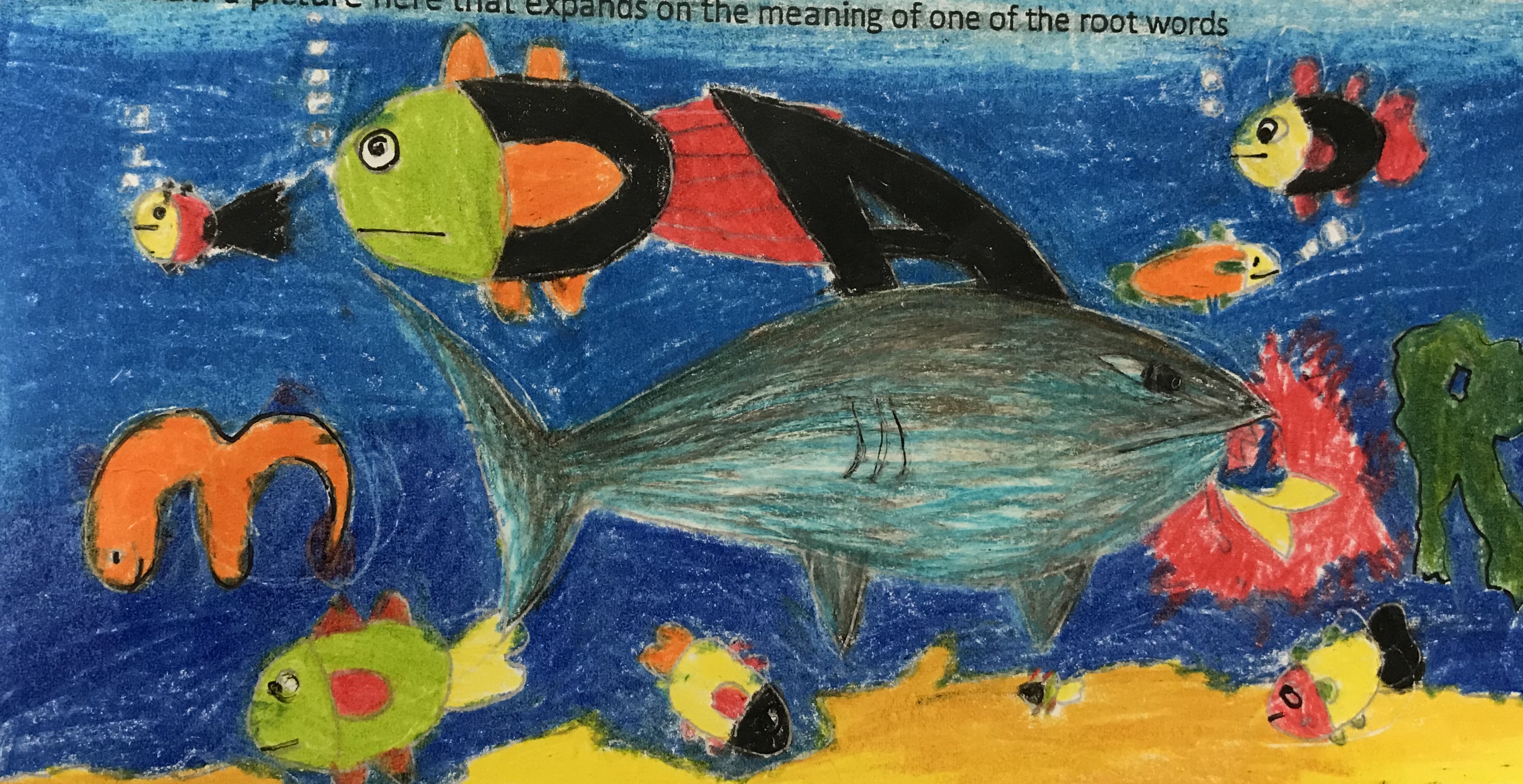
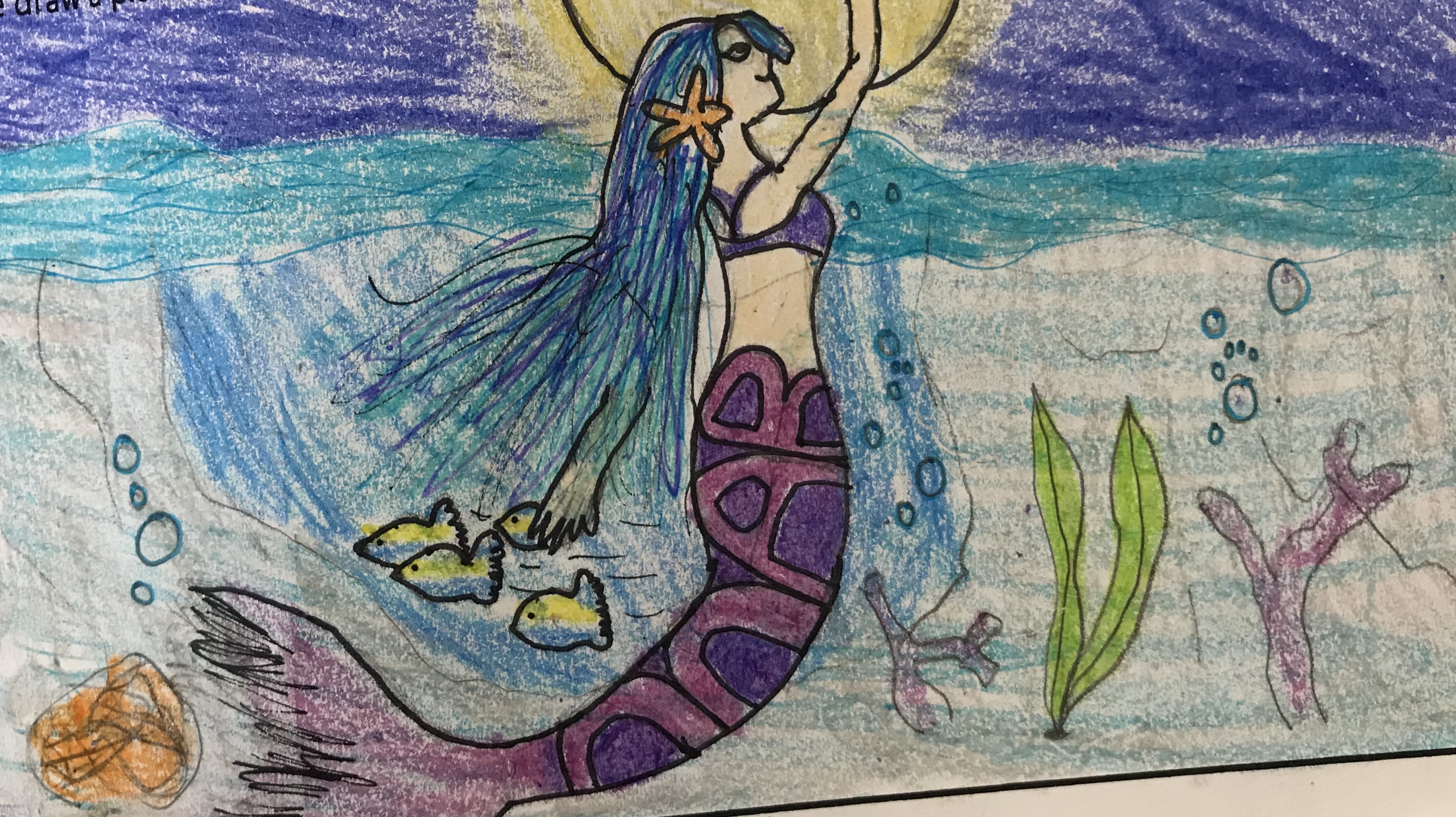
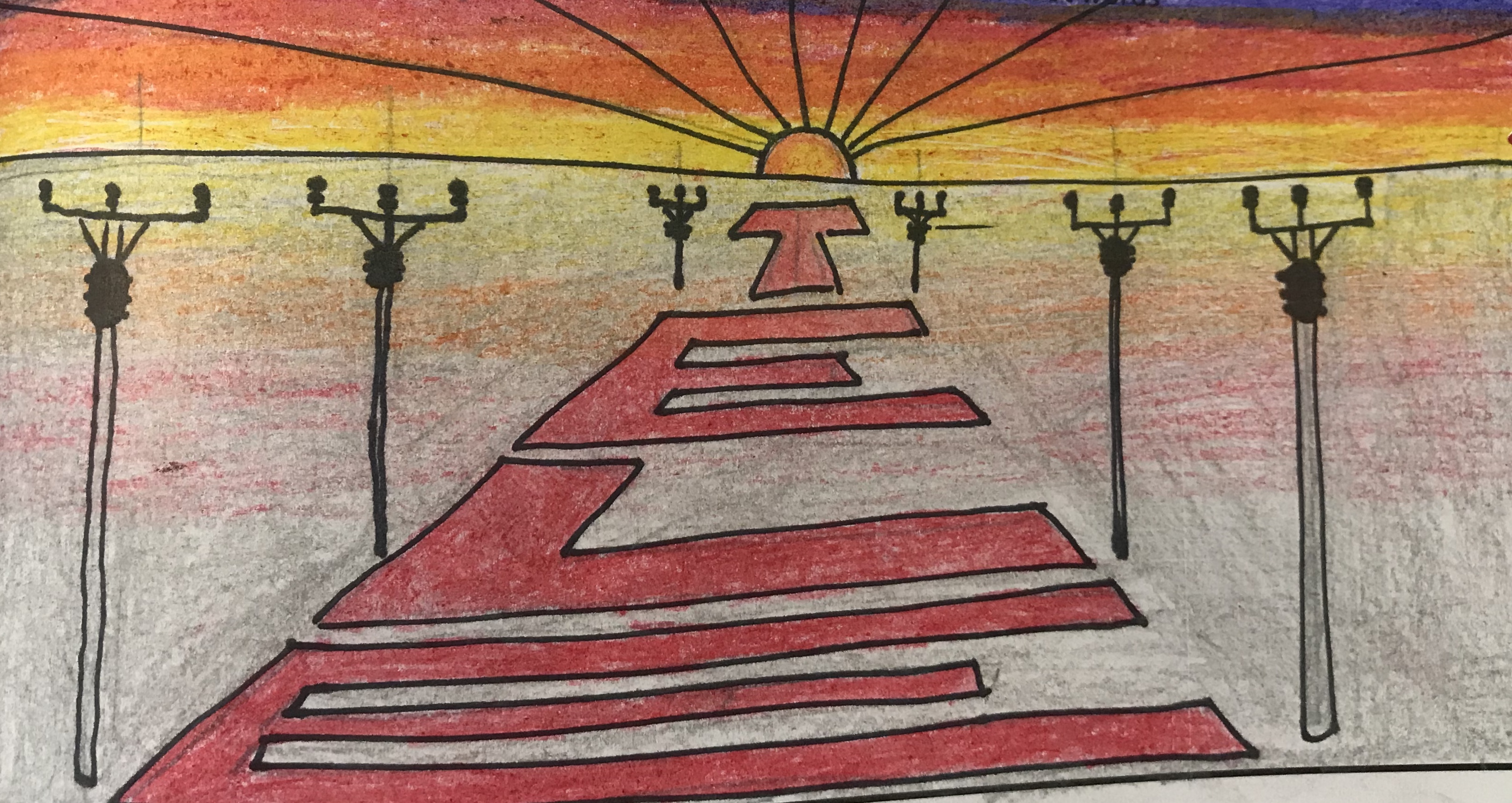
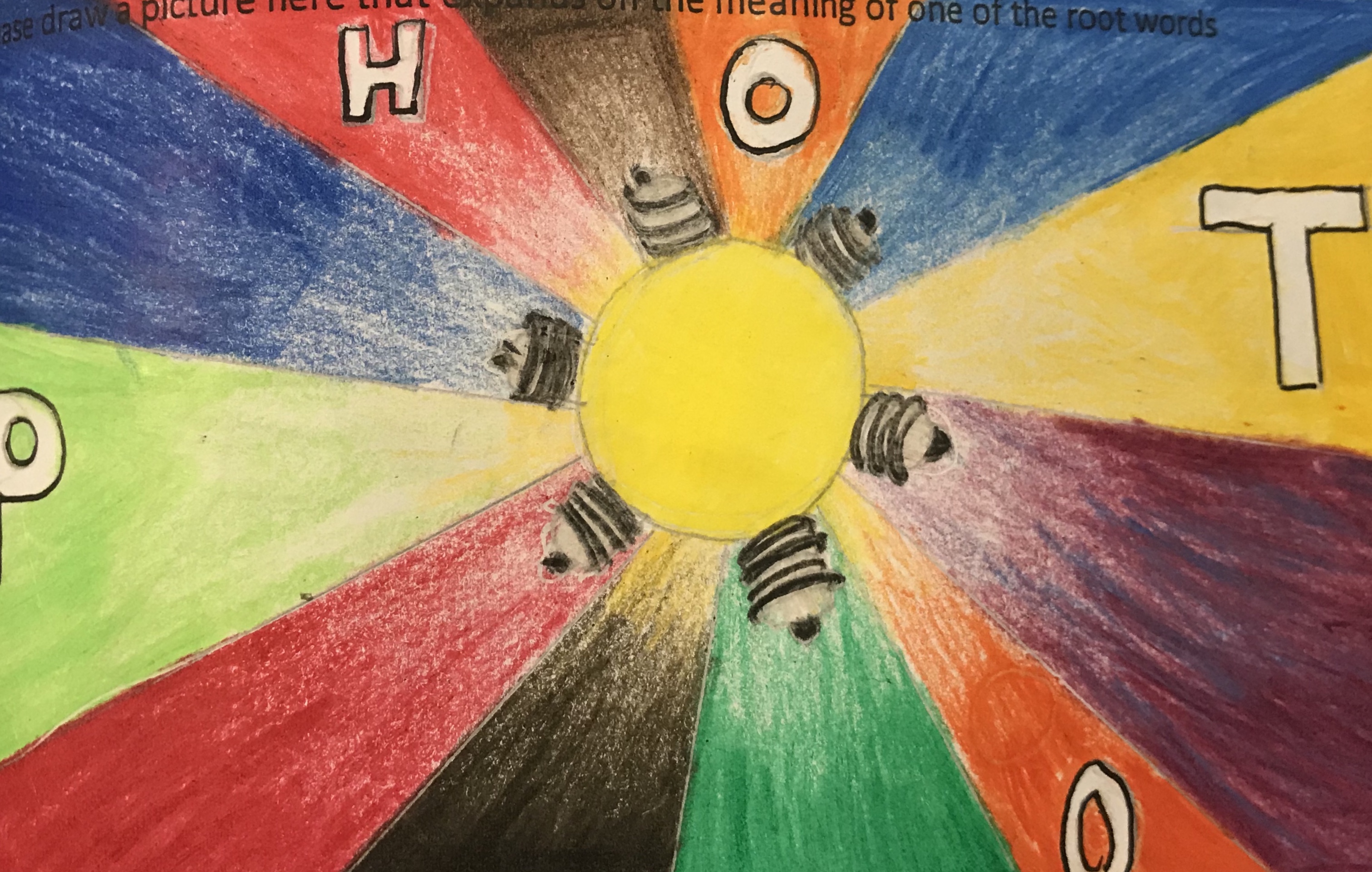
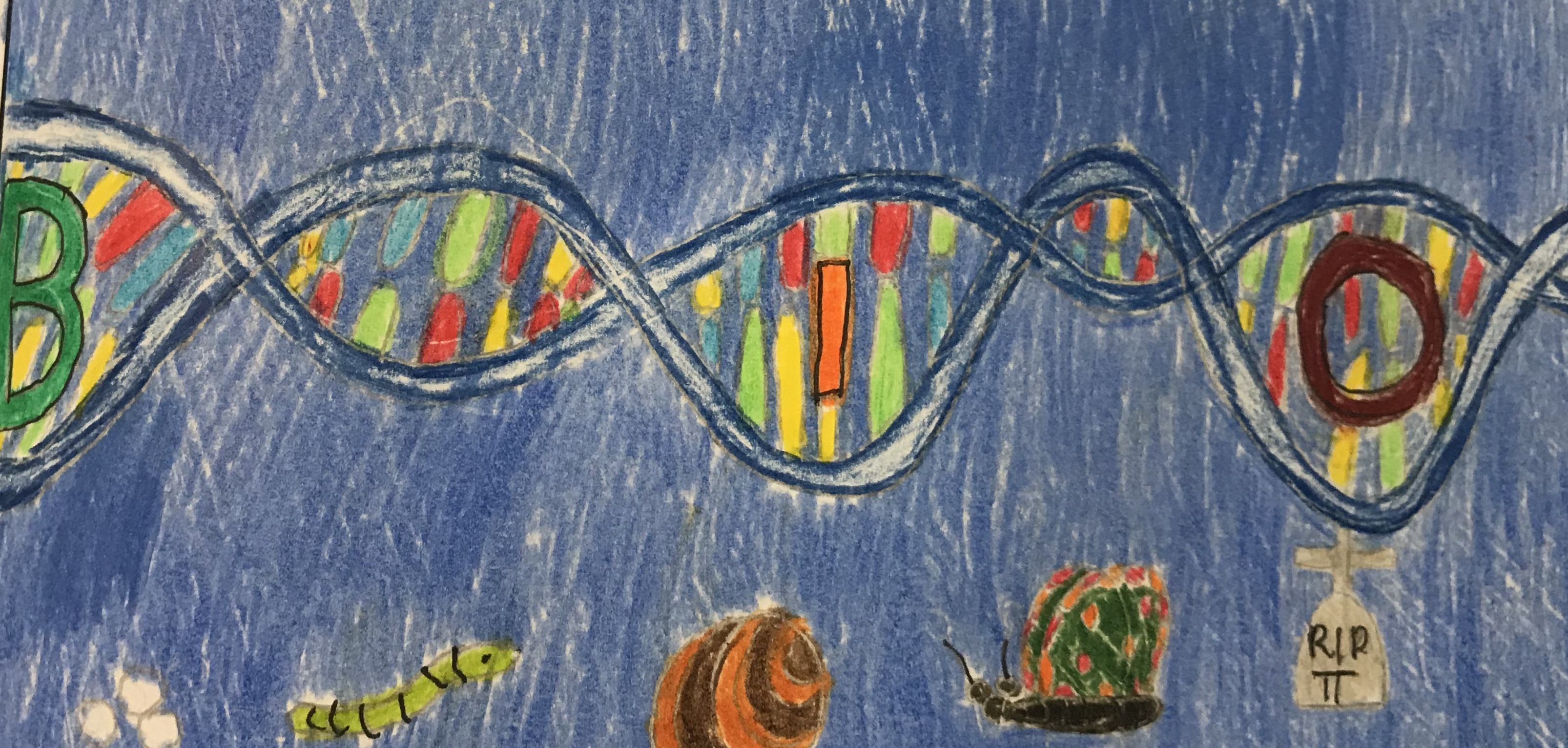
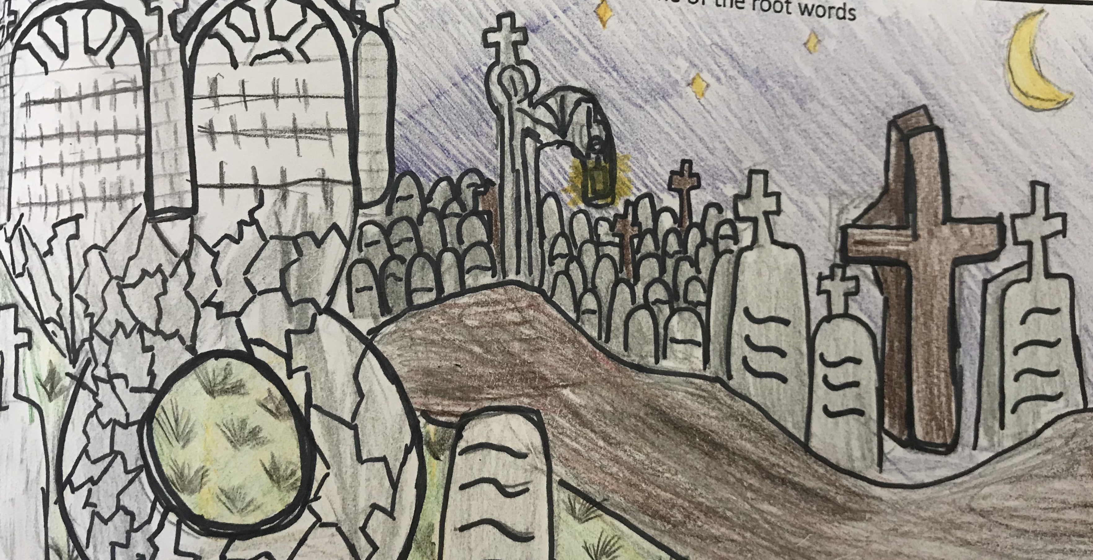
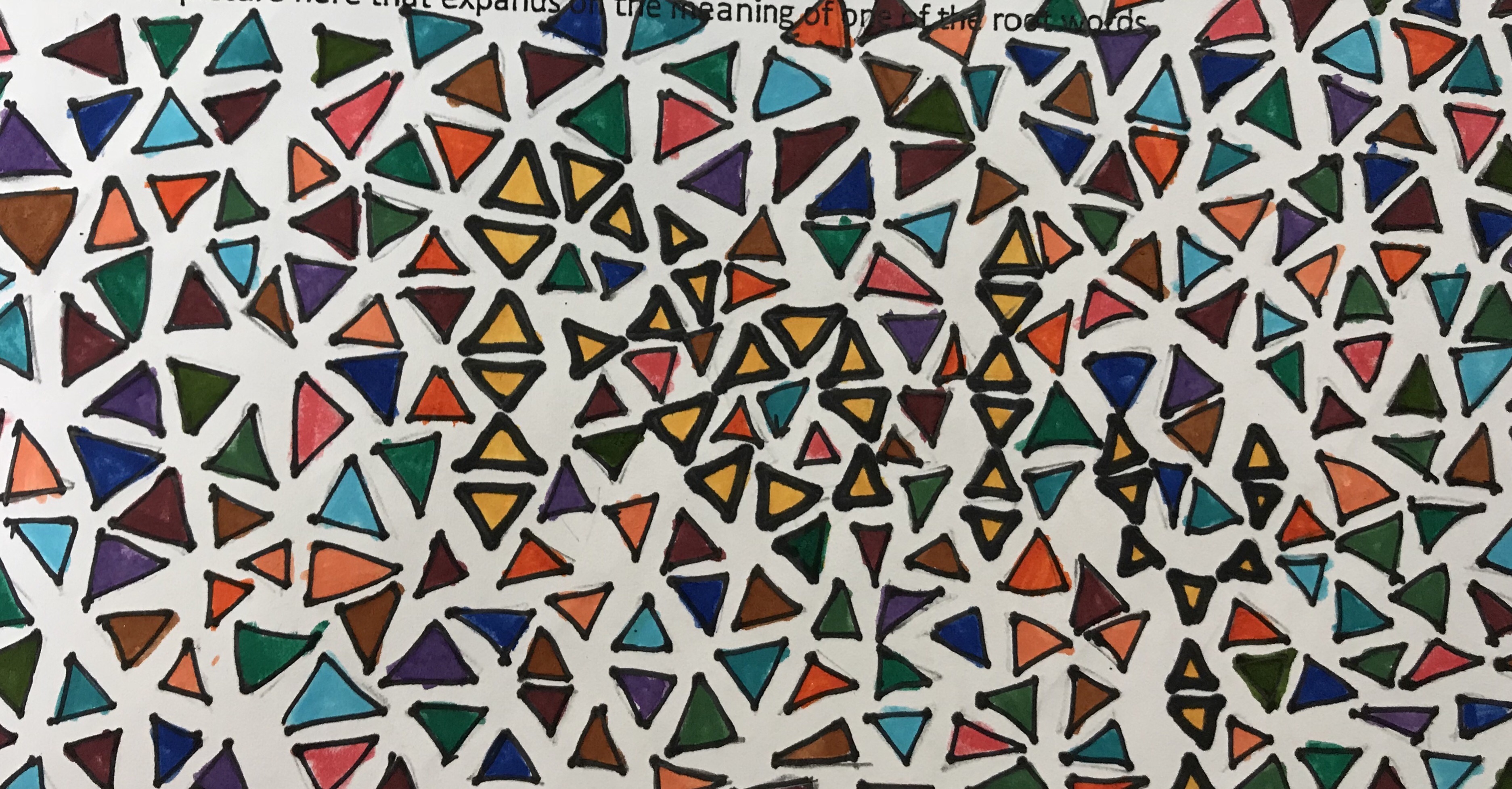
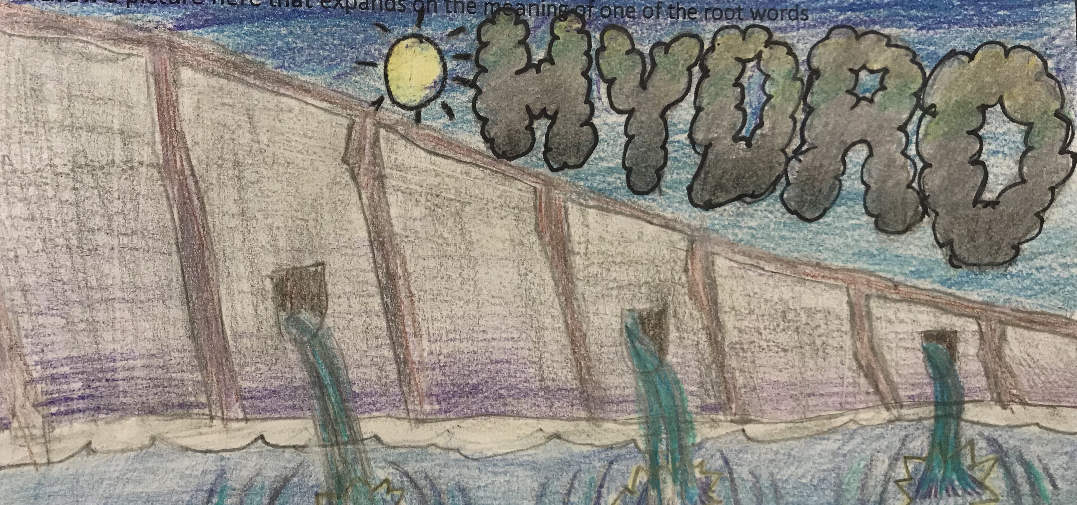
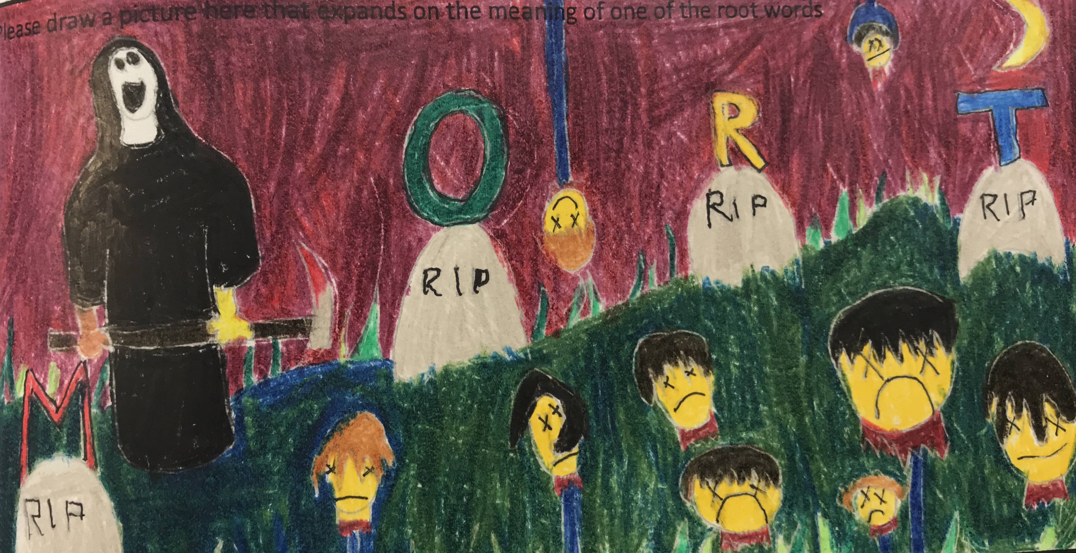
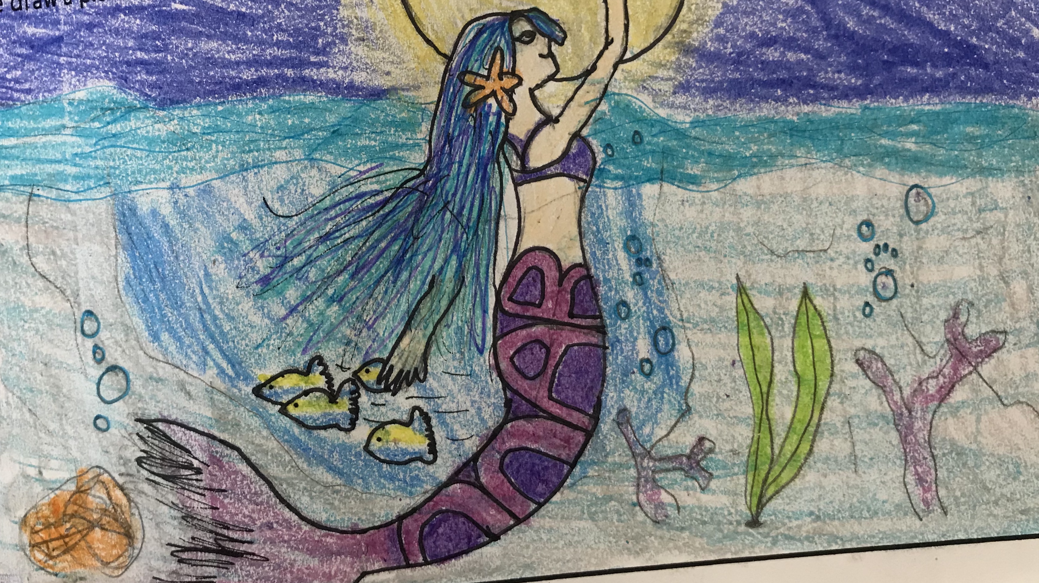
In etymology lessons, with my Grade 6 students, they learn about root words such as auto = self, bio = life, cise = to cut. They illustrate their written work with drawings that are a visual exploration of the root words. They use mixed media with an emphasis on layering colour for added intensity. Not only do they produce beautiful and interesting illustrations, they find that creating a visual helps them to remember and conceptualise the words.

4C5676FB-B891-49AC-B5F0-05FDB8A0967637E30FF1-B753-4CFA-A78E-FE667387F72D00A5CA97-AAA3-4CAC-BAF2-2C5990C8D977C0ED541F-779E-4D09-BEE8-A2D441CD0A005F5E295F-F1FD-40B5-9572-7B4E60FDE490CD2B363E-1FE1-4E46-BBCC-45A773F83503CEC58E97-A8C7-42B1-8B69-17BBC9D0CDDDF6A04330-9A98-4E44-A19C-DEB64A28864424759052-796D-47EC-B71C-7E9484C0904A0A52E3EB-988C-4A37-AA81-AD6DE979296877DC49D4-2CD2-4553-8524-FB366D498CD459F56947-4EF9-4ACF-A37D-85789BBA791A04B50E0E-17EC-4968-9C14-B3BB51BCFF2091250395-9C4B-4E1F-BB8B-AABD86BEDA1AC1211C62-09D6-4E39-B025-CAC2F1A3E8C5


Channeling Degas

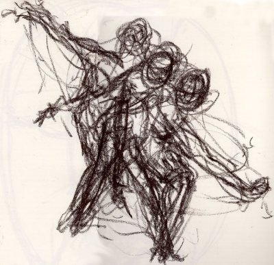
We are so lucky to have had Goh ballet student, Marsha Kwan with us today. In her beautiful Sugar Plum Fairy tutu, she held a series of poses for the students to sketch with careful observation drawing.

Students who are not accustomed to observation drawing can be nervous to begin. Once started, there is often a tendency to erase multiple times and want to restart. For some students it is difficult to commit to work that does not seem ‘perfect’. For that reason we used charcoal pencils which cannot be erased and long sheets of paper (20x60cms) to record a number of poses. We discussed the importance of observation and process and minimised the importance of the finished piece.

Marsha held her positions for 10 – 15mins and then moved a quarter turn and adapted her pose.

The students were able to maintain careful (and silent!) observation for over an hour, with ease. Their work shows a fluidity of line and sense of movement.

We will move forward with an introduction to Degas’ work and may further develop their sketches with some watercolour for emphasis

.

Movement

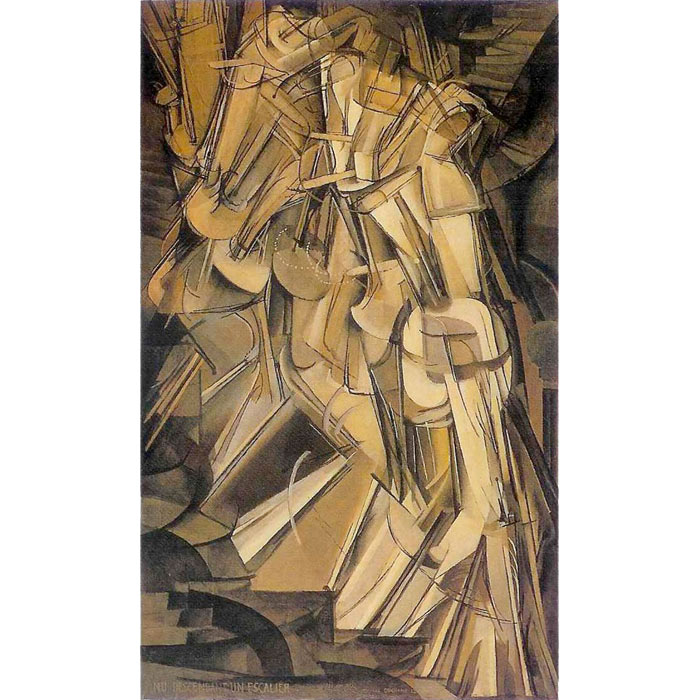
Movement is one of the principles of art that expresses the path our eyes follow when we look at a work of art. Without movement, artwork becomes stagnant. In the early 20th Century there was a great focus on ways to suggest movement. The camera had revolutionised the way that artists understood movement and artists felt the need to express movement in expressive ways.

How can we help students to express movement in their work?

  • Look at the ways that artists suggest a sense of movement with line and repetition. They also experiment with ways of applying paint by using the action of the paint hitting the surface to show movement (see action painting, Jackson Pollock).
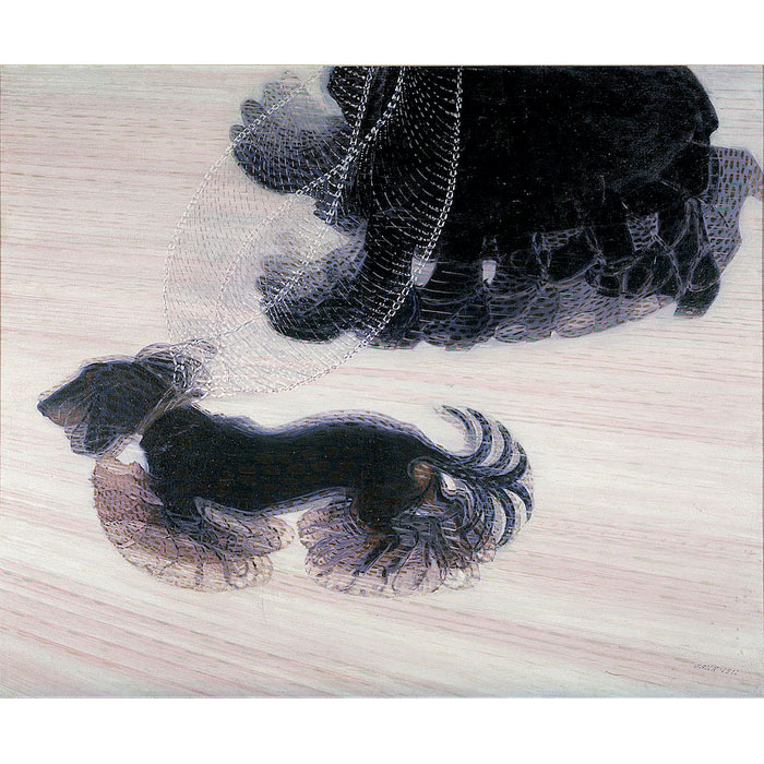
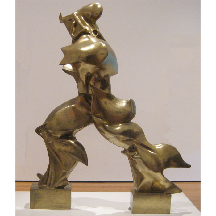
  • Futurist artists experimented with abstracting reality. They worked with dynamic shapes and lines in order to suggest movement. Giacomo Ballà was a leading figure in the group. He believed that the power and speed of machines like cars were the outstanding features of the modern age. He aimed to express this idea in works such as Abstract Speed – The Car has Passed 1913.
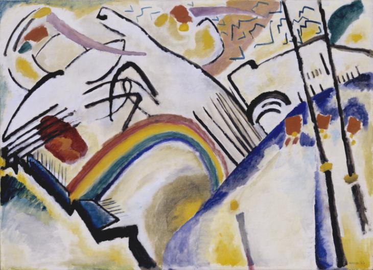
  • Some artists (Jackson Pollock, Wassily Kandinsky, Damien Hirst) listened to music while they worked and that influenced their mark making.
  • Read about gestural art for inspiration.
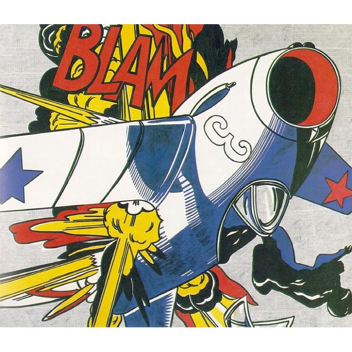
  • Graphic artists and cartoonists use specific shorthand marks to suggest movement. During the pop art era, Roy Lichtenstein took these ideas into the realm of ‘fine art’. Students can use cartoon style marks, lines and repeated overlapping images to add movement and dynamism to their artwork.
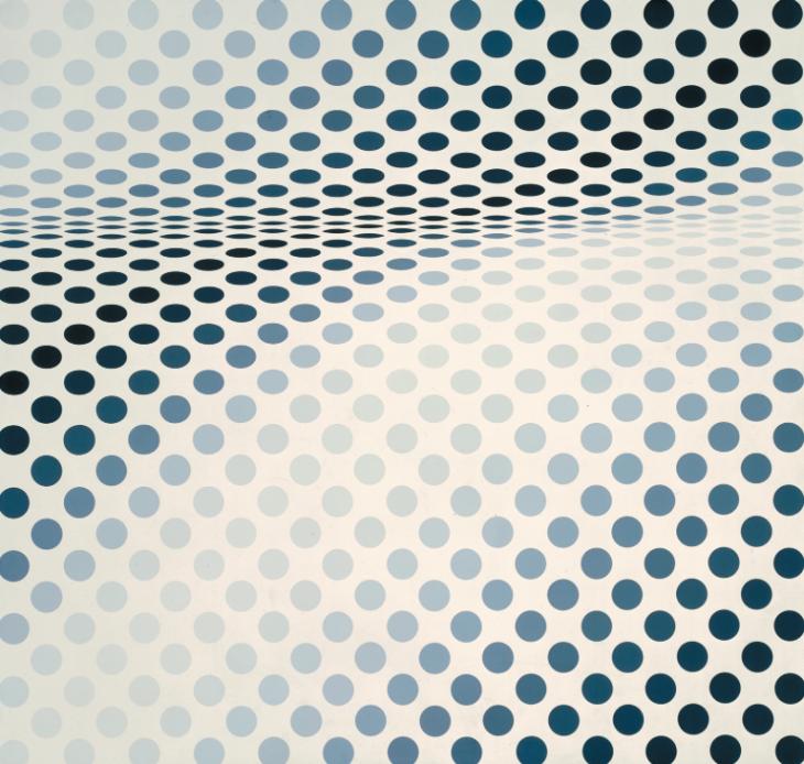
  • Another way to think about movement is op art (see Bridget Riley) to investigate how shape, line and composition can create optical illusion and suggest movement.
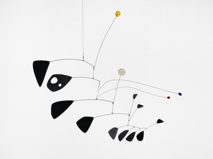
  • Mobiles (see Alexander Calder) are a simple way of creating kinetic art that explores the movement of forms and lines in space.
  • Experiment with an acrylic pour https://youtu.be/rwgeOJbDjZ0 and record experiments with an iPad.
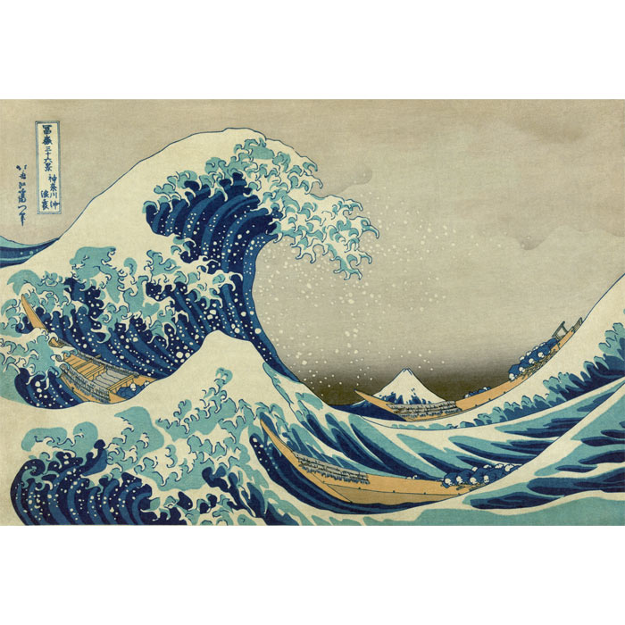
(adapted from http://www.tate.org.uk/art/student-resource/dynamism-and-movement-exam-help)roy-lichtenstein-blamKandinskyCossacks 1910-1 by Wassily Kandinsky 1866-1944Van Goghhokusai-the-waveelement-of-design-movementduchamp-nude-portray-motiondr-edgerton-golf-swingballa-dog-on-a-leashboccioni-continuity-in-spaceHesitate 1964 by Bridget Riley born 1931Antennae with Red and Blue Dots c.1953 by Alexander Calder 1898-1976


The language of art analysis

When asked to talk about a work of art, students often gravitate towards representational images because they are familiar and conform to their ideas of “good” art.  When visiting an art gallery or looking at famous works of art, students need help to see beyond what they immediately understand.

The first step is to look at the work – really look. Be patient. Although discussion is important, this close observation should be in silence.

After a period of observation ask students what they would like to say about the piece. This has to be a “no fail zone” students need to to be able to speak freely (but adhere to the dos and don’ts below)

Ask students to avoid:

  1. Discussion of whether the work is “good’ or “bad”: are any of us qualified to comment?
  2. Discussion of whether we like or dislike the work – this is not relevant to appreciation of a work and can create a  mindset that “blocks” exploration of ideas.

Ask students to focus on:

  1. What emotion is evoked with this work? What do you feel? What was the artist’s intention?
  2. Be a detective! Is there a story to be revealed? What visual clues lead you to your ideas?
  3. What are the elements and principles of design that stand out in this work. (ask students to be specific – nearly every painting has form and colour, but what is particularly important about the colour or form?)


My Grade 6 students were sharing their thoughts about Mondrian’s Composition No. 12 with Blue (see below). Analysis of abstract art can be daunting for students (and adults) But my students had a lot to say:

“The black grid is like the days of the week. It’s regular and it’s a schedule, but the blue square is like the weekend”

“It about structure and getting out of structure”

“The blue square is about freedom and getting away from a  prison”

“The blue square has a door that opens”

” The more I look, it all moves. The lines look 3D”

“When I look carefully, the rectangles are all different sizes. The only one that’s a perfect square is the blue square. maybe that’s important”


Hot dog vs Landscape

Many agree that using complex words with young children helps them to stretch their capabilities to build a vocabulary that can serve as a reservoir for conceptual understanding.

Even so, art vocabulary is often as tricky for adults as it is for kids!

I just found this website that has a wealth of vocabulary (linked to elements of design) Click here

Three small steps would be:

  • avoid value judgments such as “good” or “bad”. Does it really matter if you like it? Ask kids to focus on what they see and use the elements of design to help, “that’s a really interesting use of line/colour/ form”
  • describe orientation as portrait or landscape, not hamburger and hot-dog!
  • discuss emotional impact – how does this piece make you feel?

Hotdogthe-ultimate-hamburgerLandscapePortrait_of_a_Young_Woman,_Amedeo_Modigliani,_1918,_New_Orleans_Museum_of_Art

Creating vs Copying

Watching the documentary Beyond the Folds with my class today, reminded me how much I loved making paper cranes. Origami enthusiast Christian Marianciuc has been creating paper cranes everyday for a year.

His creations are inspired by his emotions and they involve a plethora of different techniques.  He documents his collection documented on his instagram page.

This is a great reminder that we can take something generic and transform it through personal creativity. The key is inspiring that creativity and giving enough breadth to fan the flames of individual expression.

Colour in focus!

This term, we are focusing on colour in all grades PreK – Gr 12. this is such a broad area that it can be tricky to know where to begin. Developing a sense of colour literacy can really help young artists to find their way. Using photography to seek out examples of colour combinations can be a great inspiration. Sometimes these can be found in the environment or can be created and recorded in different ways. Looking at the full spectrum is the colour alphabet. From there the vowels and consonants are the primary and secondary colours. When these are mastered, there are so many ways to explore analogous, triadic and split complementary palettes. Children will group colours instinctively, but can also be lead into new and exciting discoveries with some guidance. The dialogue that can result from justifying colour choices is especially valuable.